'Designing Blogs for Readers'

Matt Gemmell discusses the way his blog's design has changed over the last decade, and lists some ground rules for making your own site more readable.

“I don’t think there’s any reasonable way, or any need, to separate vanity and ego from a personal blog. Writing is inherently about its author, and is a product of their personality and opinions – that’s not something to be shy about, and we shouldn’t try to change it either. So, write for yourself – and hold yourself to an appropriate standard, because you’d better believe that others are judging the person as well as the piece – but as soon as you publish your views, you’re inviting readers to take a look. I think that the needs of the reader and the author are more aligned than many blogging systems seem to believe.”

I went through the list and discovered that Unretrofied meets many of the criteria Matt calls for, which I'm kinda proud of because I'm not a web designer by any stretch of the imagination.

I've just always strongly believed that sites explicitly meant to be read should not be designed so as to interfere with anybody's reading experience. That would be stupid, and I'm glad I'm not the only one who thinks so.

There are a few little things that could be changed to meet his standards (such as making visited links more obvious), along with some items that have always bugged me but I haven't gotten around to fixing yet (like the way my Fusion ad can interfere with other elements on mobile devices), but overall I'm glad to know I've tinkered my way into a fairly readable site.

Flickr Relaunches with 1TB of Free Space

Almost as if reading my mind after this morning's post, Yahoo! has relaunched Flickr with a new interface and 1TB of free storage for free users.

Pro accounts are being phased out, but existing Pro users get to keep their unlimited space, ad-free browsing, and statistics (for now). In place of Pro accounts, Flickr is now offering paid upgrades for either going ad-free ($50/year) or doubling your space to 2TB ($500/year).

The revamped UI takes cues from other social platforms like Twitter, App.net, Facebook, Google+, and Path, in that it allows you to upload a cover photo and displays your profile in a similar manner to those services. It's not wholly original or anything but I think it looks great. At least it doesn't look like 2006 anymore.

Photo pages are also much nicer, with images displayed in full resolution and shoving all the related info (description, comments, etc) below. It gives the photos a chance to breathe, which I love.

I need more time to play with this new interface, but I'm already really liking it so far. Kudos to Marissa Mayer and the Flickr team for shipping such a fantastic update.

Here is my Flickr page if you'd like to check it out.

'Man of Steel' Poster Tutorial

man-of-steel-poster.jpg

Using features in the new 2.2 version of Pixelmator, the guys over at Abduzeedo show how easy it is to create a pretty cool Superman poster. Between this and the recent Acorn 4 update, the barrier to entry for getting into graphic design is lower than ever, and I love it.

"Very, Very Flat"

I don't typically dabble in Apple rumors around here, but this one makes me very excited, with only a slight tinge of worry:

“According to multiple people who have either seen or have been briefed on the upcoming iOS 7, the operating system sports a redesigned user-interface that will be attractive to new iOS users, but potentially unsettling for those who are long-accustomed to the platform...”

"Magic is Hard"

Khoi Vinh:

“To simplify is huge, but what matters just as much is the end result, what the user gets out of the simplification. If the simplified process produces satisfactory results, great. But it’s magic when the software generates a disproportionately meaningful output from that minimized input.”

Khoi Vinh on Blackberry 10

"None of what is on display here — the clean yet unremarkable typography, the tasteful but de rigeur color gradients, the straightforward but rudimentary iconography, the communicative but nearly featureless spinners, arrows and other visual cues — is particularly distinctive or unique to Blackberry. In fact, they demonstrate a startling lack of character, almost a willful desire to be mistaken for any other random operating system."

I totally agree. My very first impression of the new Blackberry homescreen was that it looked like a cheap imitation of Android 2.2 (Froyo) from a few years ago. I think "missed opportunity" is a bit of an understatement here.

'About App Icons'

Louie Mantia:

"Consider walking down a candy aisle at a drugstore. If you have a craving for Reese’s Peanut Butter Cups, you know how to find it. Of course, it’s the bright orange wrapper with a bubbly yellow word on it. Instant. Most candy bars have very distinct brands which can be instantly recognizable at a glance of the entire aisle. This should be precisely how you approach your app icon design."

He goes on to point out some fantastic examples of app icon design, including some groups of apps that fit under a single brand and have been designed to make this fact prominent, such as Nike.

When I got to this part...

"If you take that same logic to app icons, any style you have in your app should be applied to your icon."

...I immediately thought of Check the Weather, whose icon does not match a single part about the app's interface at all. It's one of my favorite apps, but that icon is about as generic-looking as you can get. Which is a shame, since the app itself has a very unique design aesthetic.

Go read the rest of Louie's post, it's pretty fascinating.

'Designing a Responsive, Retina-Friendly Site'

"If you need to use something like Readability or Safari Reader to read my articles, I've failed as a designer."

Paul Stamatiou details the process that led to his current blog design, explaining the reasons behind every decision and iteration. I love these kinds of behind-the-scenes looks at how a great product comes together.

I'm particularly fond of the post archive page Paul has put together, it's very reminiscent of Facebook's timeline feature.

iTunes 11 "Simplicity"

Lukas Mathis analyzes the new iTunes design:

"You can’t make a complex application simple by adding a veneer of simplicity on top of it. in fact, that will just add to the confusion, because now you’re sending the user misleading signals about what’s really going on. Apple promised a «dramatically simplified new interface». They were right; the interface does look more simple. Unfortunately, this just makes the rest of iTunes all the much worse."

Stephen Hackett linked to that same piece, adding this:

"Even after a couple of weeks of daily use, I’m still uncomfortable in the new iTunes."

I agree with both of them. I've been playing around with iTunes 11 for a couple days, and it's been one of the least enjoyable experiences I've ever had with the app. As someone whose history with iTunes has mainly taken place on Windows PCs rather than a Mac, that's saying something.

I'm lucky since I rarely need to use iTunes anymore now that I'm reliant on streaming services like Spotify, Netflix, and Hulu, but I sympathize with anyone who has bought most—if not all—of their content from iTunes.

Verbs

Ben Brooks:

"Whenever I set up an iPad or iPhone for a new user, they figure out where email, phone, contacts, calendars and so forth are, but the web? That one confuses most people, because “Safari” isn’t something they are used to calling the Internet.

I very much like the idea of giving users a better understanding of what things do by using verbs instead of brand names — I think it is a natural extension of this post-pc hoopla people are caught up in."

This is an interesting idea, although I don't think I'd like it very much myself.

Let's say every smartphone brand began using 'Connect' in place of their previous browser names. We'd have to refer to these things as Apple Connect rather than Safari, Microsoft Connect rather than Internet Explorer, Google Connect rather than Chrome, etc. It would be the only way of telling them apart in discussion, and they actually are quite different products so there would be no avoiding it. Sounds like more of a pain than it's worth.

I wouldn't want to take away names of mail clients either, since some of them are so ingrained in tech culture, Outlook and Gmail in particular. 'Apple Mail' is admittedly kind of generic, but people have seemingly accepted it so I'm ambivalent there.

Perhaps a better way to help new users find the 'Internet' app would be changing the icon rather than the name. If I didn't already know what these logos represented, I don't think I would be able to immediately tell that they were for accessing websites. At least the icons of mail clients usually contain some sort of envelope metaphor, regardless of their name.

'Rethinking the Lock Screen: A Counterpoint'

Both Jim Dalrymple and John Gruber have linked to this piece in the last week. Most of its points are perfectly salient, but I strongly disagree with this section:

"Additionally, the grabber itself is flawed. It contradicts the swipe left-to-right motion that is is embedded into every iPhone users muscle memory. By the time I remember I can swipe up from the right to access the camera I've already unlocked the device the normal way.

A better solution might be to add an option to have a permanent camera "notification" that looks and acts like a standard lock screen notification. Swipe left-to-right on the camera icon to go directly to the app. It could be located on the top half of the screen below the date/time bar and would be far enough away from the regular unlock control on the bottom so as to prevent it from being accidentally triggered.

This would be more consistent with how people dismiss the lock screen and have the added benefit of being less visually disruptive to the lock screen's aesthetic balance."

There's nothing wrong with the camera's current 'swipe up' mechanic.

  • It's unobtrusive.
  • It's very easily accessible since you don't have to stretch your thumb to reach it, which I would think fits with the idea of quickly accessing the camera, yes?
  • The user could be holding their iPhone in either landscape orientation and still easily flick the camera grabber with their thumb.
  • It makes swiping to unlock the phone that much easier since it requires less 'travel' than it did before the camera button was around.

I'm having a hard time believing that anyone finds it to be a confusing feature. In fact, turning it into a constant notification would seem more confusing to me. To a user accustomed to seeing notifications on the lock screen, this would probably look like Camera.app is literally always trying to tell them something when it's not.

While I think that there are useful things that could be done with the iPhone's lock screen, this isn't one of them.

A New Look

I'll try to keep this brief. If you make a habit of visiting Unretrofied rather than reading it via RSS, then you will notice that I've been making quite a few design changes in the last couple days.​

It's not as big of a change as the last redesign obviously, but I think it's much nicer. I'm happier with the typography (now with serifs!), pages should render more nicely on e-ink displays like the Kindle, and I've started categorizing posts like I should have been doing this whole time, which means things will be easier to find from the archive.

I will also finally start using links in post titles if I'm directing the reader to another person's site. In those cases, if you would like to link to one of those posts here instead of linking the external site, you can use the timestamp link provided at the bottom of each post. I've already gone through some of the more recent posts around here and changed them to the new format.

Let me know what you think!​

A "Review" of Felix for App.net

2012-09-25_172359.jpg

I'm not an App.net (ADN) user. I've definitely considered becoming one, considering Twitter's behavior lately, but I'm still having trouble justifying the $50.​

​With that said, I've been hearing a lot about a new iOS client for ADN called Felix that just released today, and I thought this would be a good excuse to analyze some of the app's design from the perspective of someone who has no idea what using ADN is like.

Let's take it screenshot-by-screenshot.​

mzl.okthxjbj.320x480-75.jpg

This is what I assume is the main screen in Felix, basically equivalent to a Twitter timeline. Initial reactions:

  • The font choices are okay I guess, nothing special. Not sure I care for the cream-colored background. The actual ADN website has a textured gray background and white posts. If I were making a mobile client of that site, I'd probably stick with their color choices to make it seem more integrated.
  • Something about having drop shadows under every avatar irks me a little.
  • ​I can guess that the first two icons on the toolbar at the bottom are equivalent to 'Timeline' and 'Mentions' but I have no idea what the other three are for. The middle icon is highlighted blue in every screenshot, no matter what part of the app you're in, so perhaps it's a 'Compose' button. The globe icon might be a mobilized form of the public global feed, which is fine I guess but they could've used a better icon. The last icon looks like a speedometer which makes no sense to me.
  • Each post has several actions that can be performed. The arrow button is probably a 'reply to this post'​ feature, but what is the speech bubble for? Maybe that's really the reply button and the arrow button is used for sharing a given post? The recycle icon is likely a 'retweet' equivalent, and the star icon is obviously an 'add to favorites' function.
  • Seems weird and cluttered, having all of those icons inside every single post. Would be better to go the Tweetie route by swiping a post left or right and seeing the actions behind it, or the Tweetbot method of tapping a post and having a tray of options slide out below it.
mzl.hvorhhul.320x480-75.jpg

I guess this is where the speedometer icon takes you. It's obviously a details screen for a specific post in this screenshot, but what happens if you're looking at your timeline and tap that icon? What does it do then? On its own this is a confusing icon choice.​

mzl.brwckfyt.320x480-75.jpg

The 'compose' screen. The auto-complete hashtag bar in the middle is reminiscent of Tweetbot to me. The top toolbar is a bit weird.

  • The 'x' button is probably meant to cancel the post, but I can't tell what the drawer icon next to it is for.  Perhaps an upload button of some kind, but what would anybody be uploading aside from photos, which the camera button is clearly for?
  • The paper airplane is probably the 'publish' button but it's an odd choice over just having a button that says 'Post' or something. Maybe I'm weird, but it just looks like a "Send to Sparrow.app" button to me.
  • The character count should probably be moved down to the middle bar (on the right-hand side of course, so as not to interfere with the hashtag auto-complete).
mzl.mpdipvgq.320x480-75.jpg

Don't have much to say about this one. The star button at the top right is interesting, can you favorite entire conversations on ADN? The colors of the posts (the blue being your own posts and the green being people you follow?) are similar enough that they're hard to differentiate​, to my eyes.

mzl.ftwfohhl.320x480-75.jpg

Ohhhhhh, I get it. The speedometer icon means 'dashboard'. Clever. I notice that there's an option to see your starred conversations, so I guess I was correct about that last screenshot. I would say that on this screen, it's okay to have a drop shadow under your avatar since it's meant to stand out. Still doesn't make sense on the timeline, though.​

Overall, this seems like a nice app, but there are some weird UI conventions going on. Obviously, this is v1.0 so it should only improve from here, and maybe if the developer reads this post they can understand what a new user might think when they first look at the app.

Either way, it's a fun thought exercise. I recommend that other app developers do this for apps they know nothing about too, so they can put themselves in the shoes of their own first-time users.

If you're on App.net and would like to try Felix out for yourself, it's $5 on the App Store and works with both iPhone and iPad.​

Can We Please Stop Complaining About Skeuomorphism?

Ah, skeuomorphism. Ye most hated of all design practices, ever since that Sam Biddle piece came out nearly a year ago. Before then, nary a whisper was heard about the practice. But ever since then, the number of blog posts full of derision have piled up into the stratosphere, and there seems to be no sign of stopping.

Take this one from today, for example:

The issue is two-fold: first, that traditional visual metaphors no longer translate to modern users; and second, that excessive digital imitation of real-world objects creates confusion among users.

Forget that this same site published a piece only a few months ago that asked people to please move on. Most of the negative pieces written on the subject have been variations on this theme of user confusion and lack of "pixel authenticity." The subject has been ground into a fine dust by now. There's even a Tumblr dedicated to finding instances of it.

We get it. You can stop with the hate-pieces now. Everyone knows you're a designer that would never think of creating such a thing in your products. That's fine. Please shut up about it. There are other things in the world of technology and design that are actually worth paying attention to, and this seems like more of a fad than anything to be truly worried or upset about.

Web Annoyances

If you're doing any of this stuff on your website, you're doing it wrong:​

  1. ​As I scroll down an article, and about halfway down, a box appears in the lower-right corner, trying to recommend other things to me that I'm not interested in. All you did was distract me from reading.
  2. The little 'Feedback' button that appears on the left-hand side of lots of websites these days. How many people are really using that thing to leave feedback to you? All I see it doing is getting in the way of other stuff on the site, so thanks for that.​
  3. Adding extra content to the clipboard when the user copies text from the site. "Discover more content here! [link]" Not cool.
  4. A smaller margin for your actual content than what's being used for advertisements.​
  5. Navigation toolbars that wait until you've scrolled down a little, then whiz down to wherever you stop at. Haha! How quirky and cute and not annoying at all!
  6. ​Infinitely-scrolling pages that keep adding more content as I scroll, when I'm just trying to reach the navigational links at the bottom of the page.
  7. If I go to your site from my phone, and it pops up a "CHECK OUT OUR IPHONE APP!" ad that I have to get rid of before reaching the site itself, that's an immediate sign that whatever I was about to read is worthless and I close the page immediately.
  8. ​More than two share buttons (preferably none, though).
  9. "Slideshows" that are really just 9 different pages that each have a meager description of the photo, just so you can get more pageviews.​
  10. ​Such bad adherence to basic web standards that even Instapaper and Evernote can't parse your awful website into something legible.

There, I feel better.​

'The Problem with Logos'

Speaking of Andrew Kim, I'm going back through some of his older posts because I find most of them to be very fascinating, as someone with an interest in minimalist design.

This one speaks to me quite a bit because I feel the exact same way about logos being splattered all over products today. I don't buy things like clothes or smartphones just because they carry a certain brand name or logo in an obvious way. If anything, I find it to be a huge turnoff.

Regarding the Samsung Galaxy Tab (pictured above), Andrew had this to say:

Here is another example. Can you believe this? This is criminal. The Galaxy tab has 2 logos on the front and 3 GIANT logos on the back. People should go out and riot about this device. What is this, an F1 car? Verizon and Samsung should have to pay people to use this.

Couldn't have said it any better myself. If you've already paid for the device but are then forced to be a walking advertisement for the company, they should be sending you a check in the mail. Ridiculous.

Make sure to read the follow-up post, too.

On iPhone Screen Size

Photo: The Techblock

It's that time of year again. The rumor mill about the next iPhone has started spinning and theories are wildly being flung about by everyone and their grandma's dog about what features we can expect and what the new hardware will be like. The most common assumption of all? Bigger screen size.

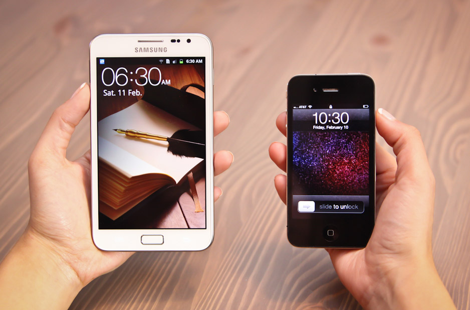
In the last year, we've seen Android and Windows Mobile 7 phones being sold at screen sizes much larger than the iPhone's humble 3.5" display. Some of these entries into the market have been comical at best (see the photo above from The Techblock's satirical review of the Samsung Galaxy Note, which is a 5.3" behemoth) while others have been somewhat more respectable, such as the Samsung Galaxy S II's 4.3" display.

The question is, does screen size really matter? Or more specifically, would a bigger screen truly improve the iPhone that much?

The most prevalent opinion I've heard on the issue is that the "sweet spot" for smartphone screens is somewhere between 4.0" and 4.5". While I don't think these numbers are outlandish by any means, I have to wonder, why the obsession with having a big phone screen?

Some background: I've been an iPhone owner for several years now (since 2008 when the iPhone 3G was released), I currently own a 4S, and I have been extremely happy with each new iteration of the phone. It's compact, it fits my needs perfectly, and any complaints I have are minor and usually reserved for iOS itself instead of the hardware.

To me, a phone should fit these two criteria for size:

  • Easy to get in and out of my pocket
  • All parts of the screen can comfortably be reached by my thumb when I'm holding the phone in one hand

The 4S definitely meets these criteria and a nice side effect is that I don't feel like an idiot holding a near-tablet-sized device to my head when I'm taking a call.

Despite my feelings about the 4S, when I browse the web I see a growing number of derisive comments about the phone, stating that Apple is losing its edge or refusing to keep up with the market. I can't take these statements seriously, given how insanely popular the device is. Obviously there is something that keeps people coming back to the iPhone year after year despite its screen size and not because of it.

If Apple were to increase the display size, they would also need to drastically increase the number of pixels or else it would no longer be considered a Retina display. This would come with all sorts of tradeoffs, the biggest two being battery life and app-developer support. Think of how many apps would have to be redesigned for the new size when so much has already gone into making apps Retina-compatible. Battery life is already only decent at best (it's not uncommon for me to have to charge my phone a little during the day in addition to my nightly full charge) so I can't see Apple making this tradeoff until they figure out a way to make batteries last much longer than they do now.

I think Apple made the right call on screen size a long time ago when the first iPhone released, and I can see no need for it to be changed that would improve my day-to-day use. At 3.5",  even the elderly can comfortably use the iPhone one-handed, while the younger hipster-types out there can easily slide it into their small jean pockets. This is what I would call the "sweet spot" since it attracts consumers from many different demographics, rather than just the tech geeks out there who think that bigger necessarily equals better.